 This is my Font cover, even though it looks finished I will probably change the image on the front to a group image, and change the colours of the masthead and text colour.
Thursday, 17 December 2009
My front cover
This is my Font cover, even though it looks finished I will probably change the image on the front to a group image, and change the colours of the masthead and text colour.


Thursday, 3 December 2009
Contents Analyis
Q Magazine - February - the contents page in this magazine runs across two pages with images placed all over the pages of relavant to articles which are featured in this magazine.The left page has the new features to this issue for example how to build the ultimate entourage. Next to the features are images relavant to the features. In the middle of the pages in the main image which is of U2 featured on the front page as well, this helps the reader know which article is the main one you should read.The right hand page features the regulars of Q music magazines, having this makes it easier for the reader to know whats new and whats a normal thing to have in a magazine. At the bottom of the magazine are images relavant to the articles and features.
Q Magazine - September 03- In this issue the contents is spread over two separate pages making you turn the page to find out what else is inside this issue. The first page of the contents area has one big image, this image is of The Rolling Stones as this is one of the most importent articles would like to see. Down the right hand side is the features list which has all the articles that will be in this months issue. On the second page is the area where the editors place the things that are always in the magazine, also the reviews that are in Q like DVD's and music related reviews. Along the right hand side of this page are images of bands and artists which are fetured throughout the rest of the magazine, and a brief idea of whats to come.
Q Magazine - September 03- In this issue the contents is spread over two separate pages making you turn the page to find out what else is inside this issue. The first page of the contents area has one big image, this image is of The Rolling Stones as this is one of the most importent articles would like to see. Down the right hand side is the features list which has all the articles that will be in this months issue. On the second page is the area where the editors place the things that are always in the magazine, also the reviews that are in Q like DVD's and music related reviews. Along the right hand side of this page are images of bands and artists which are fetured throughout the rest of the magazine, and a brief idea of whats to come.
Wednesday, 2 December 2009


Cover Analyis
 The magazine is named Rolling stones, this magazine has a target audience of the older generation, due to the music featured in this magazine being of the old days, but this magazine also features new music to try and capture the younger audience. Rolling stones is a Bi-weekly magazine., around the price of £5 an issue, but even at this price people will still buy because it's one of the most well known music magazine in the world.
The masthead is placed at the top of the cover, like a lot of well known magazine the masthead is placed behind the maim image. Rolling stone doesn't have a selling line, this is because they don't need one, Rolling stone has been going for over 20 years so the publishers are confident that even without a selling line the magazine will sell plenty of copies.
The main cover image is of Kieth Richards and Johnny Depp, both featured in a friendly 'brotherly' pose. This image positioning links to the main article name 'Kieth Richards & Johnny Depp Blood Brothers' this is about the close bond that both of them share. Right at the top of the magazine cover, they are other cover lines featuring 3 bands, probably with new music news to be told to the audience. The barcode is placed at the bottom left of the cover but in this magazine doesn't feature the issue number, this is placed just above the main image along with the date of publication.
Cover Analyis
 This magazine is called NME, which is well known for alternative music and indie music. The target audience for this magazine is like most music magazines, which are pointed towards the teenage years and mid twenty's. Each issue is a weekly issue selling around about £3 just like Kerrang. But even at this price many people will buy the weekly issues.
The masthead is placed at the top left corner of the cover, and it is placed behind the main cover image, it's placed here and not in front of the image because NME is a well established magazine so the company who publish don't have to worry about not getting any sales, so basically it could be placed anywhere and most people would still realize its NME. The selling line of NME is what NME actually stands for which is 'New Music Express' which is the philosophy of NME to give the reader; information on what new music is coming out.
The main cover image in NME is of a band named The Automatic, the band are placed in a line with the front man placed in the middle, each band member are doing their own little pose, this shows that the band are quite friendly and are jokers. The cover line is about The Automatic's past of how they became who their are, and why they are a band. In the top right corner know as the ear we have another image of Liam Gallagher with someone else, relating to the other cover lines, there are more other cover lines at the bottom of the magazine featuring album reviews and brand new music thats coming out. The barcode is placed at the bottom of the cover, featuring the date and price of publishing. The colour of the font's are yellow and red, which are bright and recognizable to anyone who knows NME.
Cover Analysis
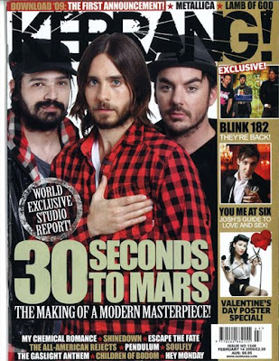 This magazine is called Kerrang, which is a well known rock and heavy metal styled magazine. The target audience for this magazine is for teenagers to mid 20's, it's quite an expensive weekly magazine selling for about £3 an issue, but it will get costumers buying it because it's a well known brand.
The masthead is placed at the top of the cover, like most magazines and is placed behind the main cover image, it's placed here and not in front of the image because kerrang know where ever they place it, people will buy the magazine. The selling line of kerrang is 'Life is loud' this is kind of a rock/metal saying because that type of music is best played very loud.
The main image is of a band called 30 Seconds To Mars, the actual image is of the whole band facing towards the reader. The main article is linked to the main image because it's about the making of the album, with the main cover line "The making of a modern masterpiece". On the left hand side they are more images of bands also featured in the magazine, with them extra cover lines indicating the main point of each image. The barcode is placed at the bottom of the page along with this is the date is was published and what number issue it was. At the top and bottom of the cover are other band names that are featured in the rest of the magazine but are not as important as the main bands featured. The company know that who ever they place on the magazine cover, a lot of fans will end up buying the magazine. The colours in Kerrang are very effective and recognizable straight away, the font is unique to Kerrang so people know that it is Kerrang not any other magazine.
Subscribe to:
Posts (Atom)