For my Foundation Production, I have created a music magazine front cover, contents page and double page spread using original images that I have took myself. I then used Photoshop to produce my products, using codes and convention of a real music magazine I hope that I have created a true look of a music magazine. To complete my work I used the aspects of LIIAR;
L-language
Institution,
Ideology
Audience
Representation
Then I have presented it all in the form of a blog. http://havocduckducksplat.blogspot.com/
Before I even tried to produce my products I had to research what are already placed into music magazines now. So I looked at the codes and convention of the music magazines, especially a front page, contents page and a double page spread. To help me understand all these things I created some textual analysis for the three different types of products I need to create. To analyse the example pages in music magazines I chose, I had to use LIIAR to fully dissect each part giving me full knowledge of the codes and conventions. It came to it that most music magazines, contained very similar ideologies and codes and conventions, such as having things placed in a readable manner and not having a wild style about it, even though they were different genres and magazines.
Conventions of music magazine front covers are, a masthead, dateline, barcode, have a main image, cover lines, main cover lines (anchorage) and a price. My own front cover features all of the above conventions of a real music magazine’s front cover.
Conventions of a double page are the features heading, some text, main image and page numbers. My double page spread contains these things. Conventions of a contents page are headings , page numbers, brief page descriptions and images. My contents page contains all these and also includes an editors corner as well.
I then created a name for my magazine, what genre it would be, target audience and LIIAR of my magazine. I then produced drafts of what my products would hopefully look like after I have finished, I first produced three drawn drafts roughly placing things where they’d look best, I then produced three IT drafts, finalising where things would go.
To produce my work I used the software Photoshop to create it all, the first thing I produce was my double page spread knowing that it would be the hardest thing to make due to the fact I had to write up an article, I created my TV logo and everything inside Photoshop itself, then with the photos I had taken, and edited in some form of way. In my DPS I made the image black and white and then chose certain parts to place in colour form, making the image stand out more. I then placed my image on the DPS next to my feature logo, I then placed the article text in boxes I had created especially for the text.
Next I created the Front page, again knowing that this would be a hard thing to do, I first created the magazine logo in the shape of DJ decks (linked to music) which are the connotations of my chosen target audience and type of music given in the magazine, then placing my magazine name (PSYKE) on top of the decks I placed all this in the top left third of my cover, I then placed my edited image which was to crop and change the colour of the whole image. I then placed my article information towards the bottom of the cover, along with other article information. Next I added the barcode into the left third of my magazine along with the price. My sell line was added underneath the masthead which again is on the left third.
Lastly I created my contents page I knew this was going to be the easiest thing to complete because content pages are usually quite simple. I started be choosing the font I wanted to use which was a ‘Greek’ style writing form, this form of font is unique to a magazine, and gives my magazine an edge against competition, a unique style. then I added boxes with headings in them stating what’s inside the magazine, in the top right corner I placed a editor corner where a ‘edit or’ briefly talks about what’s in the magazine. I then added brief overviews of what the articles were about. The last thing I did to my contents page was add two images of what is coming in this issue, scaled down and slightly edited images. Hopefully my target audience will find this style interesting as it may not be seen in other magazines with the same type of music presented in this way, this unique style could hopefully attract the attention of a well known publishing companies, who will be able to get my magazine into the public eye.
All my products follow codes and conventions of normal music magazine, such as having my masthead placed on the left third, thus helping readers find my magazine in the shops, and having things placed in the right places and not over powering any of my products. I believe my products attract my intended audience by having the DJ decks as a logo, my chosen name for the magazine because I feel it suits the music style as the kind of music my target audience listen to enter a psychedelic mood , and the genre is well presented over all my products . The drum and bass genre represents mixed social groups as many people listen to it not just one certain group. The age group I have aimed at are at the age 17+ as then many people of this age group will be able to hear this music more in clubs and parties. I attracted the target audience by choosing articles which would link to the genre. Throughout this task I have learnt a lot of Photoshop techniques, which will help me with future projects and home usage.
I acquired audience feedback by creating two polls on my blogger page, hopefully attracting people who look at it to then vote on the questions. A publishing company such as a local supermarket chain, may want to distribute my magazine because it would be something new which would entice new costumers into looking at the entertainment area of the stores. The institution I would like my magazine to be picked up by should have other music magazines under their wing otherwise my magazine may not get picked up some an institution such as Future Publishing or Bauer Consumer Media.
I think the overall media products I created are pretty well done, I think I worked well when I finally got to making my products but I know that I could of worked much faster and better if I had done it in my time. The best things in this I did in these products are the actual products itself especially the DPS and the contents page.
The things I know I could of improved on are the front cover which I found pretty hard to put together, and my overall blogging performance, but in conclusion I think I did well considering it was the first proper project I had to do.
Friday, 26 March 2010

Wednesday, 24 March 2010


Double Page Spread Finished


Here is my Finished double page spread,my finished one includes an image of the band being interviewed.
I also have another version, because I can't decide on which one I like.
Finished Front Cover

Here is my finished Front Cover for my Music Magazine, I've now added the image and changed a few things around splash like font colour and adding a black line around words for them to stand out.
Tuesday, 23 March 2010
Front Cover

This is my finalish draft for my front cover, all I need to do now is make a few small changes and add an image to it.
Double Page Spread
 This is my semi final look at the Double page spread, they may be small changes in the final product and I still need to place my images into it.
Monday, 22 March 2010
Poll
To get a fair view of my Music Magazine I have set up a poll for viewers of my blog to look at, and then hopefully vote if the agree with my given question. This will give me either postive or negative audience feedback.
Contents Page

This is my final copy of my contents page, all I need to do now is add an image and maybe change a few little things.
Monday, 11 January 2010
Article - snippet
'Sworn Sweet' are back this year to bring out their third album, 'Sweet like lemons'. This album features some quite heavy electro stylings, making this their funkiest album to date. We spoke to them in a hotel bathroom in London to talk to them about it.
After forming three years ago over the shared love of peanut butter, Libby & Phoebe reminisce over their crazy start to stardom ' We met at the Peanut Butter Alliance fan club back in late 2006, then after hanging out we came up with some cool songs'. Their first album 'Lets all hop to the shops' was released in March 2007 after searching high and low for a label 'Pie-hand' records popped out from the shadows picking them up in a instant. Now along with another experimental drum and bass group 'Lemon & Bill', Sworn Sweet could now achieve fame.
"The leading track in 'Sweet like lemons' is called 'The space Pope of Hull', we wrote this song after visiting the city, which is a hectic place I might add. The atmosphere in Hull is awesome and we played a free gig in the town centre, having death threats from chavs thrown at us left, right and center." Libby recalls. "We shot the video soon after writing it, we visited a local field and shot it at dark, we dressed up as spacemen and walked around slowly, it was great fun" Phoebe adds.........................................................
Contents Page (Draft scan)
 This is my initial draft of the contents page of a music magazine, this will look a lot better once I make it properly using a desktop publishing tool.
Thursday, 17 December 2009
My front cover
 This is my Font cover, even though it looks finished I will probably change the image on the front to a group image, and change the colours of the masthead and text colour.


Thursday, 3 December 2009
Contents Analyis
Q Magazine - February - the contents page in this magazine runs across two pages with images placed all over the pages of relavant to articles which are featured in this magazine.The left page has the new features to this issue for example how to build the ultimate entourage. Next to the features are images relavant to the features. In the middle of the pages in the main image which is of U2 featured on the front page as well, this helps the reader know which article is the main one you should read.The right hand page features the regulars of Q music magazines, having this makes it easier for the reader to know whats new and whats a normal thing to have in a magazine. At the bottom of the magazine are images relavant to the articles and features.
Q Magazine - September 03- In this issue the contents is spread over two separate pages making you turn the page to find out what else is inside this issue. The first page of the contents area has one big image, this image is of The Rolling Stones as this is one of the most importent articles would like to see. Down the right hand side is the features list which has all the articles that will be in this months issue. On the second page is the area where the editors place the things that are always in the magazine, also the reviews that are in Q like DVD's and music related reviews. Along the right hand side of this page are images of bands and artists which are fetured throughout the rest of the magazine, and a brief idea of whats to come.
Q Magazine - September 03- In this issue the contents is spread over two separate pages making you turn the page to find out what else is inside this issue. The first page of the contents area has one big image, this image is of The Rolling Stones as this is one of the most importent articles would like to see. Down the right hand side is the features list which has all the articles that will be in this months issue. On the second page is the area where the editors place the things that are always in the magazine, also the reviews that are in Q like DVD's and music related reviews. Along the right hand side of this page are images of bands and artists which are fetured throughout the rest of the magazine, and a brief idea of whats to come.
Wednesday, 2 December 2009


Cover Analyis
 The magazine is named Rolling stones, this magazine has a target audience of the older generation, due to the music featured in this magazine being of the old days, but this magazine also features new music to try and capture the younger audience. Rolling stones is a Bi-weekly magazine., around the price of £5 an issue, but even at this price people will still buy because it's one of the most well known music magazine in the world.
The masthead is placed at the top of the cover, like a lot of well known magazine the masthead is placed behind the maim image. Rolling stone doesn't have a selling line, this is because they don't need one, Rolling stone has been going for over 20 years so the publishers are confident that even without a selling line the magazine will sell plenty of copies.
The main cover image is of Kieth Richards and Johnny Depp, both featured in a friendly 'brotherly' pose. This image positioning links to the main article name 'Kieth Richards & Johnny Depp Blood Brothers' this is about the close bond that both of them share. Right at the top of the magazine cover, they are other cover lines featuring 3 bands, probably with new music news to be told to the audience. The barcode is placed at the bottom left of the cover but in this magazine doesn't feature the issue number, this is placed just above the main image along with the date of publication.
Cover Analyis
 This magazine is called NME, which is well known for alternative music and indie music. The target audience for this magazine is like most music magazines, which are pointed towards the teenage years and mid twenty's. Each issue is a weekly issue selling around about £3 just like Kerrang. But even at this price many people will buy the weekly issues.
The masthead is placed at the top left corner of the cover, and it is placed behind the main cover image, it's placed here and not in front of the image because NME is a well established magazine so the company who publish don't have to worry about not getting any sales, so basically it could be placed anywhere and most people would still realize its NME. The selling line of NME is what NME actually stands for which is 'New Music Express' which is the philosophy of NME to give the reader; information on what new music is coming out.
The main cover image in NME is of a band named The Automatic, the band are placed in a line with the front man placed in the middle, each band member are doing their own little pose, this shows that the band are quite friendly and are jokers. The cover line is about The Automatic's past of how they became who their are, and why they are a band. In the top right corner know as the ear we have another image of Liam Gallagher with someone else, relating to the other cover lines, there are more other cover lines at the bottom of the magazine featuring album reviews and brand new music thats coming out. The barcode is placed at the bottom of the cover, featuring the date and price of publishing. The colour of the font's are yellow and red, which are bright and recognizable to anyone who knows NME.
Cover Analysis
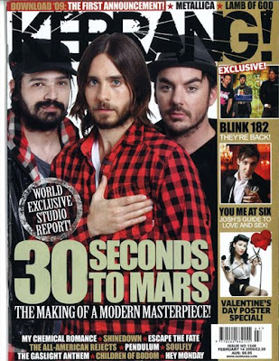 This magazine is called Kerrang, which is a well known rock and heavy metal styled magazine. The target audience for this magazine is for teenagers to mid 20's, it's quite an expensive weekly magazine selling for about £3 an issue, but it will get costumers buying it because it's a well known brand.
The masthead is placed at the top of the cover, like most magazines and is placed behind the main cover image, it's placed here and not in front of the image because kerrang know where ever they place it, people will buy the magazine. The selling line of kerrang is 'Life is loud' this is kind of a rock/metal saying because that type of music is best played very loud.
The main image is of a band called 30 Seconds To Mars, the actual image is of the whole band facing towards the reader. The main article is linked to the main image because it's about the making of the album, with the main cover line "The making of a modern masterpiece". On the left hand side they are more images of bands also featured in the magazine, with them extra cover lines indicating the main point of each image. The barcode is placed at the bottom of the page along with this is the date is was published and what number issue it was. At the top and bottom of the cover are other band names that are featured in the rest of the magazine but are not as important as the main bands featured. The company know that who ever they place on the magazine cover, a lot of fans will end up buying the magazine. The colours in Kerrang are very effective and recognizable straight away, the font is unique to Kerrang so people know that it is Kerrang not any other magazine.


Tuesday, 1 December 2009
Coventions of a Magazine
Masthead title piece: Basically the name of the magazine itself, usually place at the top of the magazine.
Price: Cost of magazine.
Date: When it was published can be weekly or monthly.
Issue number: The actual number of magazine issued since launch. e.g since the launch in 2005-2009 'The Music Magazine' has published 100 issues
Barcode: Electronically code used to determine what magazine it is and at what retail price.
Teaser: Usually phrases which grabs the readers attention.
Main Feature: Headline: summarizing the main point of the main feature. In large print, different style, bold colours in order to catch the attention of the reader. Usually connected with the image.
Subtitle: Smaller headline that summarizes another feature.
Smaller Feature: Features include in the magazine.
Images: Size: Close up to meduim close up. Image sizes help promote the magazine better.
Font: Style and size of type face.
Colour: Specific.stylistic/thematic types.
Graphics: Graphical shapes to highlight features.
Offers/Adverts Blurb: Banner-style shape featurig free poducts/promotions.
Price: Cost of magazine.
Date: When it was published can be weekly or monthly.
Issue number: The actual number of magazine issued since launch. e.g since the launch in 2005-2009 'The Music Magazine' has published 100 issues
Barcode: Electronically code used to determine what magazine it is and at what retail price.
Teaser: Usually phrases which grabs the readers attention.
Main Feature: Headline: summarizing the main point of the main feature. In large print, different style, bold colours in order to catch the attention of the reader. Usually connected with the image.
Subtitle: Smaller headline that summarizes another feature.
Smaller Feature: Features include in the magazine.
Images: Size: Close up to meduim close up. Image sizes help promote the magazine better.
Font: Style and size of type face.
Colour: Specific.stylistic/thematic types.
Graphics: Graphical shapes to highlight features.
Offers/Adverts Blurb: Banner-style shape featurig free poducts/promotions.
Subscribe to:
Posts (Atom)