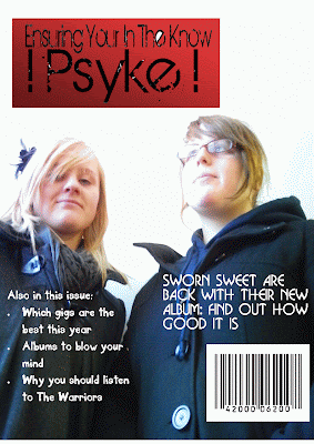
 This is my Font cover, even though it looks finished I will probably change the image on the front to a group image, and change the colours of the masthead and text colour.
Thursday, 17 December 2009
My front cover
 This is my Font cover, even though it looks finished I will probably change the image on the front to a group image, and change the colours of the masthead and text colour.
Thursday, 3 December 2009
Contents Analyis
Q Magazine - September 03- In this issue the contents is spread over two separate pages making you turn the page to find out what else is inside this issue. The first page of the contents area has one big image, this image is of The Rolling Stones as this is one of the most importent articles would like to see. Down the right hand side is the features list which has all the articles that will be in this months issue. On the second page is the area where the editors place the things that are always in the magazine, also the reviews that are in Q like DVD's and music related reviews. Along the right hand side of this page are images of bands and artists which are fetured throughout the rest of the magazine, and a brief idea of whats to come.
Wednesday, 2 December 2009
Cover Analyis
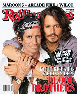 The magazine is named Rolling stones, this magazine has a target audience of the older generation, due to the music featured in this magazine being of the old days, but this magazine also features new music to try and capture the younger audience. Rolling stones is a Bi-weekly magazine., around the price of £5 an issue, but even at this price people will still buy because it's one of the most well known music magazine in the world.
The masthead is placed at the top of the cover, like a lot of well known magazine the masthead is placed behind the maim image. Rolling stone doesn't have a selling line, this is because they don't need one, Rolling stone has been going for over 20 years so the publishers are confident that even without a selling line the magazine will sell plenty of copies.
The main cover image is of Kieth Richards and Johnny Depp, both featured in a friendly 'brotherly' pose. This image positioning links to the main article name 'Kieth Richards & Johnny Depp Blood Brothers' this is about the close bond that both of them share. Right at the top of the magazine cover, they are other cover lines featuring 3 bands, probably with new music news to be told to the audience. The barcode is placed at the bottom left of the cover but in this magazine doesn't feature the issue number, this is placed just above the main image along with the date of publication.
Cover Analyis
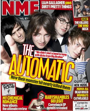 This magazine is called NME, which is well known for alternative music and indie music. The target audience for this magazine is like most music magazines, which are pointed towards the teenage years and mid twenty's. Each issue is a weekly issue selling around about £3 just like Kerrang. But even at this price many people will buy the weekly issues.
The masthead is placed at the top left corner of the cover, and it is placed behind the main cover image, it's placed here and not in front of the image because NME is a well established magazine so the company who publish don't have to worry about not getting any sales, so basically it could be placed anywhere and most people would still realize its NME. The selling line of NME is what NME actually stands for which is 'New Music Express' which is the philosophy of NME to give the reader; information on what new music is coming out.
The main cover image in NME is of a band named The Automatic, the band are placed in a line with the front man placed in the middle, each band member are doing their own little pose, this shows that the band are quite friendly and are jokers. The cover line is about The Automatic's past of how they became who their are, and why they are a band. In the top right corner know as the ear we have another image of Liam Gallagher with someone else, relating to the other cover lines, there are more other cover lines at the bottom of the magazine featuring album reviews and brand new music thats coming out. The barcode is placed at the bottom of the cover, featuring the date and price of publishing. The colour of the font's are yellow and red, which are bright and recognizable to anyone who knows NME.
Cover Analysis
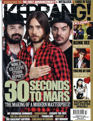 This magazine is called Kerrang, which is a well known rock and heavy metal styled magazine. The target audience for this magazine is for teenagers to mid 20's, it's quite an expensive weekly magazine selling for about £3 an issue, but it will get costumers buying it because it's a well known brand.
Tuesday, 1 December 2009
Coventions of a Magazine
Price: Cost of magazine.
Date: When it was published can be weekly or monthly.
Issue number: The actual number of magazine issued since launch. e.g since the launch in 2005-2009 'The Music Magazine' has published 100 issues
Barcode: Electronically code used to determine what magazine it is and at what retail price.
Teaser: Usually phrases which grabs the readers attention.
Main Feature: Headline: summarizing the main point of the main feature. In large print, different style, bold colours in order to catch the attention of the reader. Usually connected with the image.
Subtitle: Smaller headline that summarizes another feature.
Smaller Feature: Features include in the magazine.
Images: Size: Close up to meduim close up. Image sizes help promote the magazine better.
Font: Style and size of type face.
Colour: Specific.stylistic/thematic types.
Graphics: Graphical shapes to highlight features.
Offers/Adverts Blurb: Banner-style shape featurig free poducts/promotions.
Coventions of a Magazine plus analysis
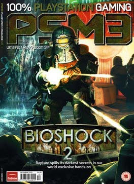
This magazine is called PSM3, which is a gaming magazine directed towards those who play video games and only for people who like playing PlayStation 3 games. The magazine is aimed to the over 15's as there is a age rating in the bottom right of the cover, this will be due to the fact that most video games now usually are over the age of 15 as a rating, and also because theirs a wider audience of gamers over the age of 15. PSM3 is a well known PS3 magazine so the company know that even if they conceal their Masthead, they will still get plenty of magazine sales. Their selling line 'Uk's No.1 PlayStation 3 magazine' proves to the readers that this magazine is well known so it's probably a good magazine to pick up and read to find out all the information you need on PS3 games.
There main image is of an up-coming game named Bioshock 2, and that's all what PSM3 want the reader to know that's inside the magazine, this isn't because the other games in the magazine are rubbish, it's because this game is a big game and know that readers will see the cover and buy it just because of that game. the cover line is just below to tell the reader just a little bit about Bioshock 2. With the image it fills up all of the cover this helps readers or new readers from the distance recognize it's about the game and then find out which magazine it's previewed in, this also helps with the size of the Masthead which is pretty big and noticeable from a far, the colour of the font matches with the actual game. In the bottom left corner is the date of publishing which in the case of this magazine is every month, also with the date is the bar code and then finally who actually publishes the magazine, in this case 'Future Publishing' who own quite a few gaming magazines.
My Target Audience
- People who enjoy music
- Especially the genre D'n'B genres like that
- Aimed towards 17+ to about 30 years old
- Aimed at both males and female
- Available to anyone who could afford it. (£1 issue)
- Monthly issue's
With this target audience I hope I will be able to cater to a lot of people musical needs. Due to a lot of people liking that type of music. I will hopefully be able to present the magazine in a way that is eye catching for the audience and is easily recognisable.
Uncut- Bob Dylan
The background colour is more of a bright formal feel to it, but it doesn't really go with the black and white background, it doesn't really fit in with the whole confrontational feel to the photo. The actual article itself is written in a formal 'catching up' type way with how he is with Bob Dylan making the reader feel like both the writer and Bob are having a relaxing time. A small title which says Bob Dylan in a little black box is placed at the top of every page to ensure that the reader knows what article they reading.
The Word- John Martyn
The text is more formally laid out on the page due to the article being more of a serious tone. The article is placed on a black and white set out making it easy to read but also proving more how formal the article is.
Also on the image is a number of quotes from the article giving you an outline of the content. On the bottom of the magazine is the magazines website which could mean that if you visit the website you could find extra information about the article and other music related information. Also the date is placed to tell us which issue we are reading.
MOJO- Double Page Spread
The articles title is placed on the right page and has very bold and big font, with the title 'A change is gonna come', this is actually one of Bob Marley's songs he had written. The font itself feels stamp 'like'. The little paragragh at the bottom of the page seems to take a serious tone for the article meaning that the rest of the article is probably going to be more of a informal way rather then formal like the photograph. The words 'Bob Marley' and 'Andy Gill' are highlighted in the paragraph to show who that article is about and who actually wrote it.
Monday, 23 November 2009
Conventions of a music magazine.

- Music related Masthead, this is iconographic of music because NME stands for New Musical Express this takes up the top left part of the magazine cover.
- Images that are suitable for a music magazine (bands, artists), this helps the reader identify that the magazine they look at is a music magazine.
- Selling line on this magazine tells the reader, what this does is tells the reader what the main marketing point of that magazine is. Or the philsophy of the editoral team.
- Related music information to that magazine this helps define the actual genre of the magazine IE music, and also the genre of what music is in the music magazine.
- Fonts and colours that will relate to the audience, this makes the magazine more presentable to the audience.
Monday, 16 November 2009
My Action Plan
Here is my action plan, this is what I have to do in this part of the Music magazine project.
Brief
Define LIIAR
Conventions of music magazines and compare to non music mags
Conventions of music mag front cover, both in music and non music mags
Conventions of contents pages, both in music and non music mags
Conventions of double page spread, both in music and non music mags
IT drafts; front cover, contents page, double spread
Hand drafts; front cover, contents page, double spread
Mind map
Mood board
Textual analysis
Planning; Camera shots, name, audience, programmes, cover stories etc.
Target Audience.
Pictures, Diagrams, Videos, Links
Typography- fonts, size, colour?
Organisation- Models, location, costume, props, angle.
Denotation -What you see. & Connotation - The meaning
Evaluation.
Wednesday, 11 November 2009
LIIAR
I- Institution is the term used to describe who is behind the production, the companies like television channels, magazine publishers, radio stations and other companies.
I- Ideology is the term used to describe the idea of what the magazine is selling. Things that are important that should be included into it. So for example a video games magazine's ideology would be the actual games itself and for the ideology of a music magazine would be music.
R- Representation is the term used to define how something is presented to someone or soemthing. For example how we see the way the protaganist acts in a film or how a picture is taken of a band and how we see it.
Friday, 23 October 2009
Thursday, 22 October 2009
Evaluation
I first looked at who would my magazine be aimed at audience wise, then going on to say what programs I would be using to actually create my final pieces. I then went on to looking at which ways I could present the magazine to the student population. I then started creating drafts for the contents page and front cover this would then help me decide how I would present my work in the final copy. After I had done this I then set out my layout, this would then give me a better idea of where things will be placed.
After doing more planning (seen in this blog), I started to take photograph, my original idea was to take photos of a student stood outside the main building with the wyke sign placed behind the model, but these shots weren't up to good standards so I had to go back to the drawing board, after deciding on what I will do I then went on to taking the final photos which were of a student looking/working on the table, I took multiple shots and picked the best one I was going to use.
I then went on edit my image, using photoshop I highlighted the model, then selected the outside area (the background), I then made the background black and white whilst the the model and folder stayed the normal colour. This will appeal to the readers because it will be something different to look at and original
In publisher I started to create the front cover of the magazine, seen as though I had already drafted the front cover it didn't take me that long to create the final front cover . My masthead is the strongest point of the cover because it has a USP which is that its going down the left grid, which is different to most magazines out there. I used bold purples with a blue background so the magazine would stand out well then other competitors. I think these colours will appeal to the student population.
I used most coventions of a magazine for example a masthead, barcode, articles and much more, this is good because then alot more people will see it and know its a magazine.
I learned how to use publisher in this brief, so from now on i will have a good knowledge of publisher for future briefs.
Selling line
- Creating a better College life for you
- Helping you get through college
- It's the only magazine you'll ever need
- A rough guide for students
- Getting you through the year
- The best College magazine ever
- Made by students for students
What designs I will use
- Green
- Purple
- Blue
- Red
Slight changes
Photos
 This shot may be seen as a bad one because the model is smiling as if he may be messing around, but also a good shot because it show the friendliness and fun side of college life.
 This shot is good because it shows the student getting on with his work, but theirs a slight blur to the right hand due to turning the page whilst the photo was been took.
 This shot is good because the model has a straight face in the photo and is getting on with his work.
 This shot is probably the best one from this model because it shows the friendliness of the student but also the seriousness that he wants to get his work done.
 This shot is good because the model is smiling, so it shows the friendliness of students at this college. But it good be seen as the model was messing about.
 This shot isn't that good because the model was making a scrunched up face which wouldn't be suitable in a magazine.
 This image is of a student reading over his work, this shot is a medium close up of his body, these shots above have a very clever Mise en scene because by looking at each photo you know that it is set in a classroom. This photo is good because you can that the student is working hard on his work which you would expect from students in a college environment.
Finished Contents page
List of usable articles
- Why don't some colleges have good entrainment facilities.
- College myths and legends revealed
- Should students have to pay for printing credits?
- College meals....overrated?
Final draft of the front cover

With the final draft I made some major changes to the actual cover.
I decided to move the masthead to the left third of the cover pointing down, the reason I did this was because if the magazine was placed on shelves along with others you would see my Masthead along the side so readers whould probably pick up my magazine first and not others.
By doing this I had to move the image to the right hand side but I wont lose anything benifits from moving it.
I also changed the look of the other articles area, making look more professional and not just a simple box with words in it.
Second rough draft of front cover

With this draft I created, I went on to 'tidy up' what I had done in the first one. After giving the Masthead a name of 'Stepping Up' I added this to the draft I like the name 'Stepping Up' because as one of my previous posts say, College is a step up from high school life.
I also decided what would go into the image area, after chosing what would go in which is someone stood outside the College grounds, I also added this into the second draft. Also choosing what article would go with the image.
apart from adding these things I haven't really changed anything layout wise.
Rough Draft of front cover

This is my first draft of what I want my front cover to look like when it's finally done. It has a simple layout but hopefully the readers will enjoy this, because it's what there used to in other magazines, seen as most magazines follow the same conventions.
The image will take up most of the cover because it's what most reader will look at first whilst others may look at the other articles featured in this magazine. So I will make the area with other articles stand out along with the main image and main article so it'll appeal to all audiences.
I have placed the masthead on the top because this is seen as a normal covention of magazines to always place them at that point.
Wednesday, 21 October 2009
Name of the college magazine
I chose this name because its the fact that most students are stepping up especially from coming from high school, and I think it shows how modernized this magazine actually is.
Organisation of how I will accomplish my work.
I will use the outside of the old main building outside using the background to capture the essence of college grounds, I will get the 'Wyke' sign in the right side of the frame.
The model will be dressed in his/her own college clothes of they own choice. I won't be using any props because I'd rather have just a student stood there in a formal position.
College Mood

Here is the mood board I created for the college magazines, I found images of front covers of college magazines and laid them out to pick the main conventions out and looked at what worked as a front cover and what didn't. This will hopefully help me create a suitable front cover for my own college magazine.
Tuesday, 20 October 2009
Mood Board
Monday, 19 October 2009
Layout of a contents
Layout of front cover

Here is my first draft of a layout I created for a college magazine, the USP* of this layout is that the masthead on here is going down along the left third instead of the traditional horizontal layout this is vital for the magazine company so when the magazines are place in a row, this one will be clear to see because you would see the masthead first.
Thursday, 15 October 2009
Analysis of a contents page

The contents page from the NME magazine has been separated under headings on the right hand side:
- Features
- News
- Radar
- Reviews
- Live
In certain stories there's a little red arrow next to them, this indicates that the story featured on here is a story that is featured on the front cover. Each story is clearly highlighted in bold black with the page number in red, also indicated clearly.
On the left side you have a 'Band Index' this is here too help the readers find a certain band they enjoy listening too, which are featured in the magazine. This area is highlighted heavily in the colour red with the bands name in white blocks and black writing, this helps make the 'Band Index' stand out to the readers.
At the top of the page you see the NME logo, reminding you that, this is the magazine you are reading and also next to this you have in big bold black lettering the words 'This Week' which is clearly indicating that the NME magazine is a weekly one. Just underneath this is the date of publication or the date that this issue was first released for the public.
In the center of the contents page is two photos featuring members of the group Oasis, this has been placed there because it highlights that fact that they have just kicked off a big tour, and this also features news about a new drummer joining they live tour. These photos will have been placed there to grab Oasis fans attention and make them read about the current goings on of that band.
Why I choose Photoshop Redone
Some of the advantages of using Photoshop are:
- Professional outcome
- More creativity
- Improve your skills
- Been able to have the outcome done your way (more control)
Target Audience
Also teachers of the college could find the magazine useful, it may help them find out important information about certain things relevant to help them teach students.
Tuesday, 13 October 2009
What is a Masthead
Coventions of a contents page
- Having suitable images for your articles
- Page numbers to direct you
- Sub heading underneath your main headings
- Contact numbers- E-mails
- Features and regular features
- Who's writing the articles and features (editorial team)
- Type face/colour - highlight cover stories
- Must be formal
Sunday, 11 October 2009
College magazine analysis

This image I found is actually a cover for a college magazine, and found it to have many conventions you would find in a lot of magazines.
The masthead in this magazine is effective because its big and bold and is the actual name of the college itself. Then the main article 'Doing science at Beloit' is connected to the front cover picture, which is of some female doing chemistry. Also on the cover is the date the magazine was published and other articles that are featured in the rest of the magazine.


Creating a Magazine cover in Photoshop
Conventions of a college magazine
- Masthead with the name of the college on it e.g Wyke
- For the 1st issue have a main picture of the college grounds
- Other pictures for other issues to be relevant to the main articles
- Articles that are relevant to the actual college life
- Modernized look to it to catch the target audience's eyes
Friday, 9 October 2009
Software
- Photoshop
- A word processer
- A document publisher
- Also a speacilised magazine software program
Monday, 5 October 2009
Conventions of a contents page
- Pictures relavent to the article been written
- Page numbers to help readers find they way around
- Sub-Headings to give out extra information
- Contents page must work
- Font colours to help certain things stand out
- Font size to grab the readers attention
Monday, 28 September 2009
Codes & Coventions of a magazine
- Mastheads
- Photos
- Pictures
- Bright bold colours
- Contents page
- Infomation
- Fonts
- Articles for students and teachers
- Links to websites
- Related information to the magazine been created
The Brief
Main Task: The front page, contents and double page spread of a new music magazine. All the images and text used must be orginal, produced by you-minimum of four images.
Presentation of your work
The presentation of the research, planning and evaluation may take the form of any one, or combination of two or more, of the following:
- A presentation using slideshow software such as PowerPoint;
- A blog
- A podcast;


